data <- read_csv("https://github.com/fivethirtyeight/guns-data/blob/master/full_data.csv?raw=true")
Background - Gun Deaths In America
In 2014, there were more than 33,000 gun deaths in America. Data from the CDC, FBI, Mother Jones database, Global Terrorism database, and the U of M IPUMS project were all combined into one dataset here. Information includes death counts, homicides, police fatalities, mass shootings, terrorism gun deaths, and population totals.
Data Visualizations
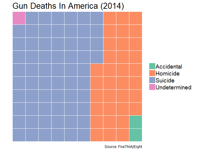
based on 33,599 gun deaths in 2014 in the U.S.
Death by Intent
vis1 <- data %>%
  mutate(new_date = paste0(year,"/",month),
         new_date = parse_date(new_date, format = "%Y/%m")) %>%
  select(-c(X1, year, month)) %>%
  filter(new_date >= "2014-01-01", new_date <= "2014-12-01")

nrows <- 10
df <- expand.grid(y = 1:nrows, x = 1:nrows)
categ_table <- round(table(vis1$intent) * ((nrows*nrows)/(length(vis1$intent))))
df$category <- rev(factor(rep(names(categ_table), categ_table)))

ggplot(df, aes(x,y, fill = category)) +
  geom_tile(color = "white", size = .5) +
  scale_x_continuous(expand = c(0, 0)) +
  scale_y_continuous(expand = c(0, 0),
                     trans = 'reverse') +
  coord_fixed() +
  scale_fill_brewer(palette = "Set2") +
  labs(title = "Gun Deaths In America (2014)",
       caption = "Source: FiveThirtyEight") +
  theme(axis.text    = element_blank(),
        axis.title   = element_blank(),
        axis.ticks   = element_blank(),
        legend.title = element_blank(),
        plot.title   = element_text(size = 20),
        legend.text  = element_text(size = 14))

Suicide and Homicide take up the majority of deaths and seem to peak in the summer. This may be different than what would be assumed, that suicide deaths are probably higher in the winter. Perhaps they are if we were able to separate by areas that have longer or harsher winters.
Death by Intent and Season
data %>%
mutate(month = parse_integer(month)) %>%
group_by(year, month, intent) %>%
summarise(count = n()) %>%
mutate(season = case_when(
month %in% c(03,04,05) ~ "Spring",
month %in% c(06,07,08) ~ "Summer",
month %in% c(09,10,11) ~ "Fall",
month %in% c(12,01,02) ~ "Winter"),
season = parse_factor(
season,
levels = c("Winter","Spring","Summer","Fall")
)) %>%
group_by(year, season, intent) %>%
summarise(total = sum(count)) %>%
mutate(ratio = total / sum(total)) %>%
filter(year == 2014) %>%
ggplot(aes(season, ratio, fill = season)) +
geom_bar(stat = "identity", show.legend = F) +
scale_y_continuous(labels = scales::percent) +
geom_text(aes(x = season, y = ratio + .07, label = scales::percent(ratio))) +
coord_flip() +
facet_wrap(~intent) +
theme_minimal() +
labs(x = NULL,
y = "\nPercent",
fill = NULL,
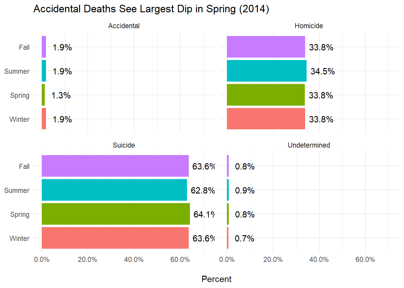
title = "Accidental Deaths See Largest Dip in Spring (2014)")
Deaths by Sex
data %>%
  mutate(month = parse_integer(month)) %>%
  filter(year == 2014) %>%
  group_by(sex) %>%
  summarise(n = n()) %>%
  mutate(pct = n / sum(n)) %>%
  ggplot(aes(sex, pct, fill = sex)) +
    geom_col() +
    geom_text(aes(x = sex, y = pct + .05, label = scales::percent(pct))) +
    scale_y_continuous(labels = scales::percent) +
    labs(x = NULL,
         y = "\nPercent",
         title = NULL,
         fill = "Sex") +
    theme_minimal() +
    theme(axis.text = element_blank(),
          plot.title = element_text(size = 16),
          legend.text = element_text(size = 12),
          axis.title = element_text(size = 14),
          legend.title = element_text(size = 14),
          panel.grid = element_blank())
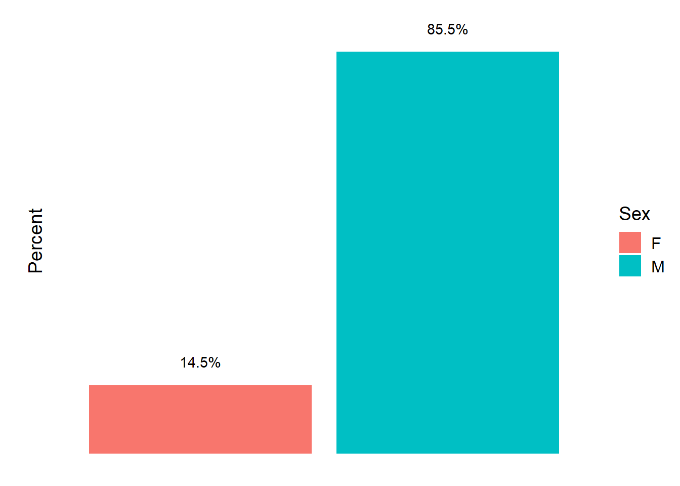
Males are around six times more likely to die from guns than females.
Deaths by Race
data %>%
  mutate(month = parse_integer(month)) %>%
  filter(year == 2014) %>%
  group_by(race) %>%
  summarise(n = n()) %>%
  mutate(pct = n / sum(n)) %>%
  ggplot(aes(reorder(race, pct), pct, fill = race)) +
    geom_col(show.legend = F) +
    geom_text(aes(x = race, y = pct + .05, label = scales::percent(pct))) +
    coord_flip() +
    scale_y_continuous(labels = scales::percent) +
    labs(x = NULL,
         y = "\nPercentage of Deaths",
         title = NULL,
         fill = "Race") +
    theme_minimal() +
    theme(panel.grid = element_blank(),
          axis.text.x = element_blank(),
          plot.title = element_text(size = 16),
          legend.text = element_text(size = 12),
          axis.title = element_text(size = 14),
          legend.title = element_text(size = 14))
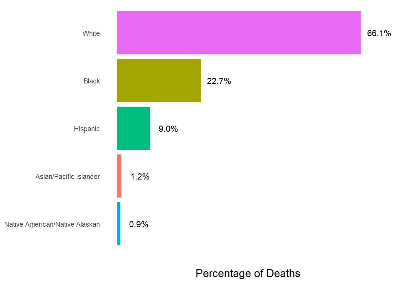
Whites were most affected by gun deaths in 2014, followed by blacks and Hispanics.
Death by Place
data %>%
  mutate(month = parse_integer(month)) %>%
  filter(year == 2014) %>%
  group_by(place) %>%
  summarise(n = n()) %>%
  mutate(pct = n / sum(n)) %>%
  drop_na(place) %>%
  ggplot(aes(reorder(place, pct), pct, fill = place)) +
    geom_col(show.legend = F) +
    geom_text(aes(x = place, y = pct + .05, label = scales::percent(pct))) +
    coord_flip() +
    labs(x = NULL,
         y = "\nPercentage of Deaths",
         title = NULL,
         fill = "Place") +
    theme_minimal() +
    theme(panel.grid = element_blank(),
          axis.text.x = element_blank(),
          plot.title = element_text(size = 16),
          legend.text = element_text(size = 12),
          axis.title = element_text(size = 14),
          legend.title = element_text(size = 14))
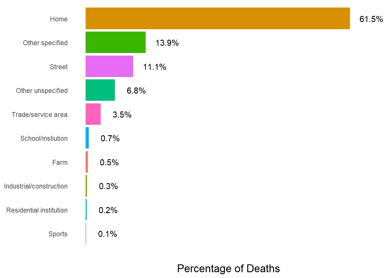
The home is the most common place for gun deaths.
Deaths by Education Level
data %>%
  mutate(month = parse_integer(month)) %>%
  filter(year == 2014) %>%
  group_by(education) %>%
  summarise(n = n()) %>%
  mutate(pct = n / sum(n)) %>%
  drop_na(education) %>%
  ggplot(aes(reorder(education, pct), pct, fill = education)) +
    geom_col(show.legend = F) +
    geom_text(aes(x = education, y = pct + .05, label = scales::percent(pct))) +
    coord_flip() +
    labs(x = NULL,
         y = "\nPercentage of Deaths",
         title = NULL,
         fill = "Education") +
    theme_minimal() +
    theme(panel.grid = element_blank(),
          axis.text.x = element_blank(),
          plot.title = element_text(size = 16),
          legend.text = element_text(size = 12),
          axis.title = element_text(size = 14),
          legend.title = element_text(size = 14))
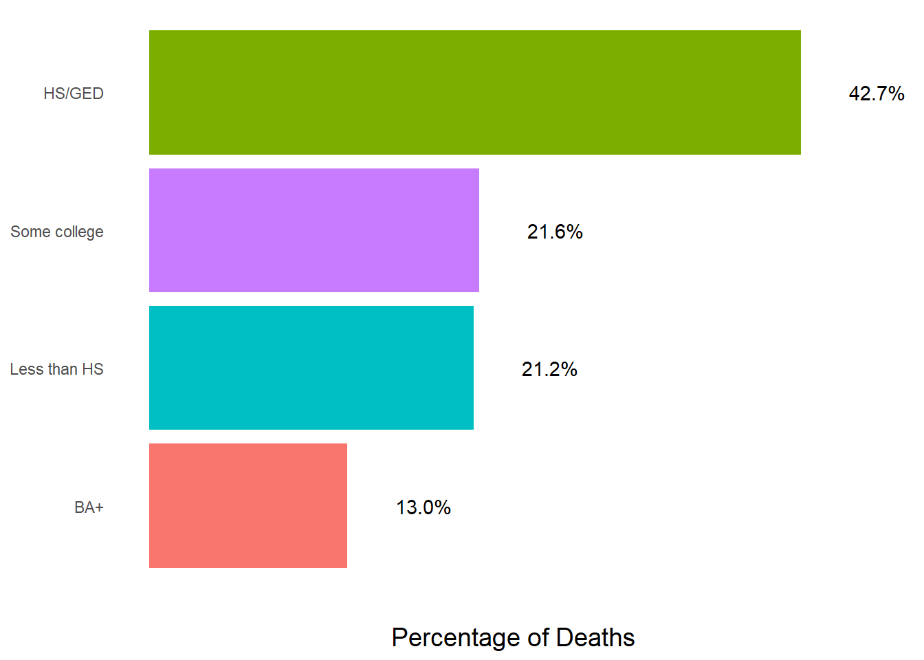
Surprisingly, more gun deaths occur to people who have completed high school compared to those who have not.
Conclusion
It is clear that in all seasons, commercials tailored to addressing the majority of gun incidents would need to focus on the suicidal white males in the home who have completed only high school. Although, any directed commercial should have a broader target range to reach all who are affected by gun incidents.