Background
This data comes from the famous Gapminder dataset on GDP per capita and life expectancy and population. I noticed there was an outlier, Kuwait, that had to be removed.
Change in GDP per capita and life expectancy
gapminder %>%
  filter(country != "Kuwait") %>%
  ggplot(aes(lifeExp, gdpPercap,
             col  = continent,
             size = (pop)/100000)) +
    geom_point() +
    scale_y_continuous(trans = "sqrt") +
    facet_grid(~ year) +
    labs(y    = "GDP per capita",
         x    = "Life Expenctancy",
         size = "Population (100k)",
         col  = "Continent")

Looking at GDP per capita, some continents have have experienced a high level of growth while Africa has remained stagnant. Countries in Asia, however, have seen a spike in GDP growth in the last few decades. All countries have experienced a modest move to higher life expectancy.
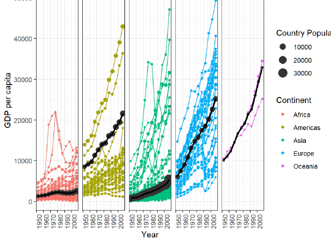
A closer look at GDP per capita by continent
by_continent <- gapminder %>%
  filter(country != "Kuwait") %>%
  group_by(continent, year) %>%
  summarise(weight_avg = weighted.mean(gdpPercap, pop),
            pop        = sum(as.numeric(pop)))

gapminder %>%
  filter(country != "Kuwait") %>%
  ggplot(aes(year, gdpPercap, col = continent)) +
  geom_point(aes(size = pop/100000)) +
  geom_line(aes(group = country),
            show.legend = F) +
  geom_point(data = by_continent,
             aes(year,
                 weight_avg,
                 size = pop/100000),
             col = "gray20") +
  geom_line(data = by_continent,
            aes(year, weight_avg),
            col  = "black",
            size = 1) +
  facet_grid(~ continent) +
  scale_y_continuous(trans = "sqrt") %>%
  labs(y    = "GDP per capita",
       x    = "Year",
       size = "Country Population (100k)",
       col  = "Continent") +
  theme_bw() +
  theme(axis.text.x = element_text(angle = 90))

This graph better communicates change in GDP over the years. Here we can see clearly that Africa isn’t progressing nearly as rapidly as the rest of the continents.